High Noise, Low Signal - A Lesson in Affordances
Foreword
Our six-month-old hates sleep. This is not uncommon for infants, apparently, though difficult to comprehend given how much his parents would like regain the sleep they’ve lost since his birth. We know white noise helps put him to sleep (or is an excellent placebo), so we purchased a white-noise machine from Amazon. The baffling lack of research that went into this device is a case study in itself. Let me tell you about it.
What is Affordance?
In UX design, an affordance refers to the perceived and actual properties of an object that determine how it can be used. It is the relationship between an object’s design and the user’s ability to recognize its function. For example, a button on a webpage suggests it can be clicked, and a slider implies it can be dragged.
User Context
Accessibility is not the sole domain of disabled users. There exists a wide range of contextual accessibility needs:
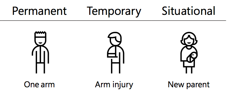
The machine lives on my side of the bed, and I only use it when the room is dark. This is the backdrop (context) that informs the rest of my complaints about the UX of this machine.
Zero affordance
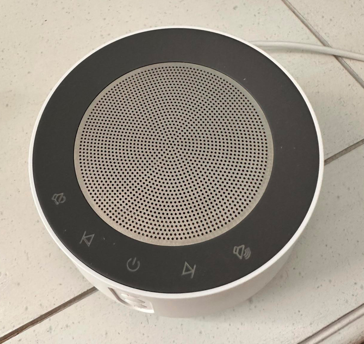
There is a vertical trio of buttons on the face of the machine. None of them have a tactile cue as to which one is which, but because there are only three of them, I can know which one does what because I can feel the buttons and I have commited all three to memory. That is not the case with the assortment of buttons on the top, which exist along the perimeter. (I am not excusing a lack of additional tactile cues on the button trio — think of the raised bit on the F and J keys — but these buttons are the least offensive part of the machine).
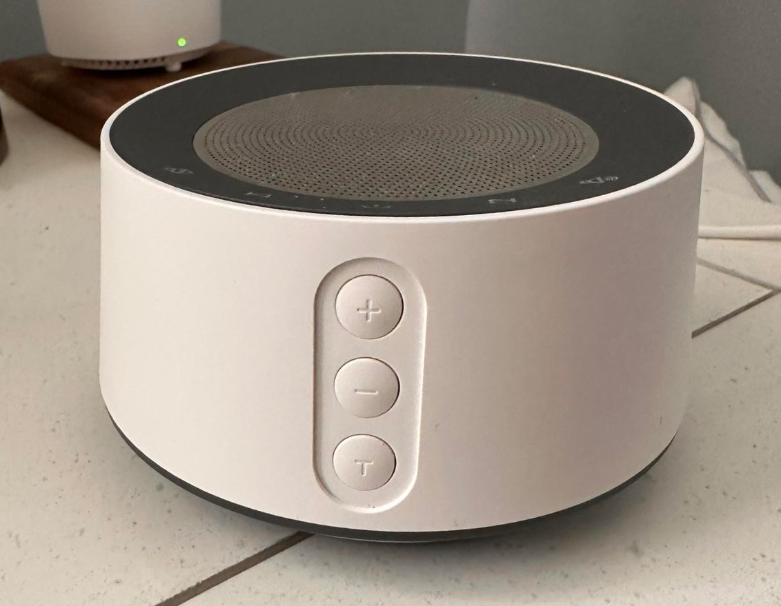
As you’ll notice, these top buttons are neither raised nor have a tactile cue, and (the picture does not show this, but be assured) there is no backlight. Recall I only interact with this thing in darkness, so if I tap one of these buttons in error, I have to orient the machine (swiftly) in my mind to figure out where the opposite command is, so I can reverse the action I just took. This is a wholly unenjoyable problem at two or three in the AM, which is when my son likes to wake up to babble for a spell before dozing back off.
A Warm Light in the Darkness
I felt a bit less foolish about this one, as my wife said she only recently figured out how this works (recall we only interact with this thing in the dark): The top mesh is a capacitive touch switch. Tapping it, even lightly, causes a warm (~3000K) light to come on underneath the trio of buttons. Continued presses cycles the thing through three or four intensities like any other touch-sensitive light. A normal interaction:
- Lay the child to sleep in his crib
- Press the power button on the device
- Whoops, my fingers grazed the mesh, so now there’s light a-shining
- Try to retrace my steps and turn it off somehow
- Press the volume up button in error, as the buttons are invisible at the night. Now there are two (light, disruptive sound) issues to deal with
- Unplug the thing in frustration
- Plug it back in; light comes right back on
- Press what I now think is the light-control button
- Mistakenly press the timer button; “TIME: 15 MINUTES” heartily announced
- Cycle through all time modes, each a sonorous proclamation
- etc., etc.
To be clear, the fault lies not with the light itself: A nightlight certainly has some value. The execution baffles, however.
Research, Research, Research
This is an example of “tell me you did no research without telling me…” Were any parents involved in the making of this item? I doubt it. It’s a tiresome affair altogether.
Fixes
Were I able to iterate on this design:
- Make the top buttons real buttons rather than flat ones, so I know if I am about to press one. This removes the risk of pressing in error.
- Additionally, add a backlight to the top buttons. A soft, dim white light will suffice. This helps me understand what I am doing in the dark, which is the main (only) time I use this device.
- Add a tactile affordance to at least the center top button. This is another effort to reduce pressing in error.
- Normalize iconography (this is a daytime-use suggestion: Note the use of both + and 🔊 to indicate the same action. This reduces confusion for the user.
- Just use a normal dial for the nightlight. The mesh surface is too large for capacitve touch.
- For that matter, put the light control near the light. Observe the Law of Proximity.